blog
Talking to clients about Visual Design direction
By Nav Pawera Design November 20, 2015

Like at every other step of the design process, you need to involve your clients when trying to set the visual design direction of a project. This can be a very confusing and ambiguous conversation, so it is important to structure it.
Here at buUuk we’ve been using an exercise called the “20-second Gut Test” to kick off discussions about visual styles. This happens usually right after we’ve finished the main wireframes and are ready to begin work on the UI.
This exercise will help you to:
- Get a feel of what your clients like (& dislike)
- Present your thoughts on what styles might suit the project
- Collectively establish a starting point for your visual style exploration (i.e. discuss next steps)
That last point is important, because it gives you a starting point which everyone agrees upon. This will prevent surprises when you present your initial designs as your clients will know what to expect.
Here’s how you do it:
- Make 20 slides with each slide containing images/screenshots representing similar styles. Pick images/screenshots that are related to the project (app screenshots, website screenshots, logos etc). Also make sure you pick enough visually different styles so you have a variety of styles to go through (flat UI, bright colours, muted colours, high contrast, illustration heavy, minimalist etc). Number all your slides.
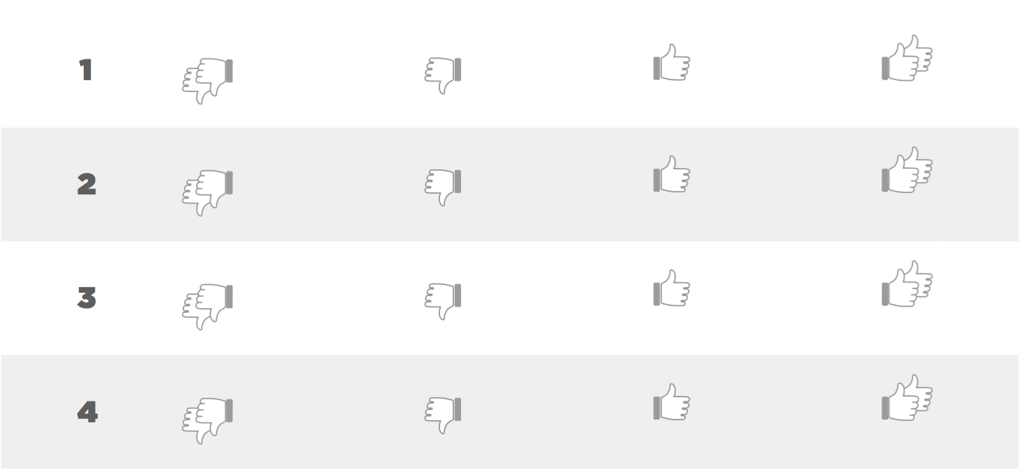
- Get all project stake holders into a meeting room and hand out a printed likert scale. Show them each slide for about 10 seconds and have them rate the slides. I usually go for a 4-scale likert scale as removes the neutral option and forces everyone to either like or dislike a style. Download a sample pdf file here (and .pages file here). Here’s an example:

- Collect all the feedback and pick up the slides that had extreme ratings (lowest & highest). Go through these slides and ask the group what was liked or disliked about these slides. (You don’t need to compile the results in an excel sheet — you’re just looking for the edge cases as a starting point for the discussion. This is not decisive quantitative data.).
The goal here is not to decide the design direction, but to filter out the ones likely not to work and give yourself some hints on where to start by looking at the styles your client was favourable to.
Important Note: make sure you make it clear that you’re looking for feedback on the overall style & not specific design details (which is why you run through the slides fairly quickly i.e. under 10 seconds).
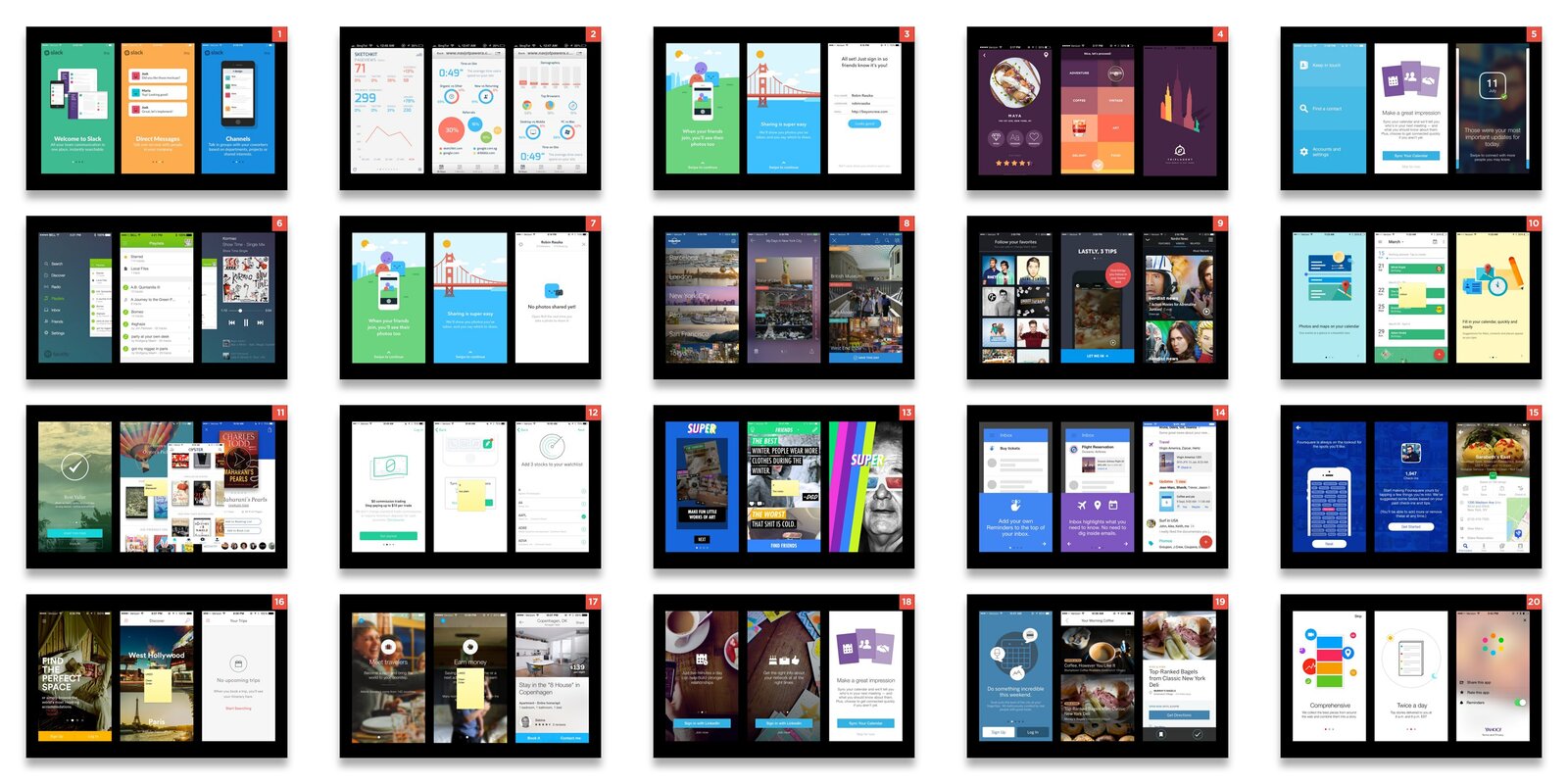
As we design apps, we end up using screenshots from other apps for our slides. Here’s a few sample slides that we have been using recently:
Download the Keynote file here. Head to www.pttrns.com to quickly grab some more screenshots to make your own slides.


