Quickly check & calculate time across timezones
When you live across the world, finding a time to talk – whether it’s about work, the weather or the weekend – can be a logistical challenge. We wanted to find a way to take the hassle out of figuring out time zones and constantly calculating time differences.
Client
Buuuk Apps
Deliverables
iOS App Design & Development
Period
2015 – Ongoing
The Design Process
Simplicity and ease of use were the key motives when we started thinking about Klok. Apple had just launched their widgets for iPhone, so we started looking at these, as they’re easy and quick to access; you don’t even need to unlock your phone to view them.
We also knew that once the app was set up, the user interaction would be minimal, as the regular time zones in which users are interested don’t change that often, so widgets felt like a perfect solution.
We were also keen to test out a good way of allowing users to change time without taking up a lot of space or requiring multiple steps.
So we started with some quick sketches …
Details, Details, Details
Getting all the little details right was critical to have a clean and simple design. This meant going through a number of different iterations before we landed on the best solution.
After a few rounds of discussions, we decided to move right along into high fidelity UI design.
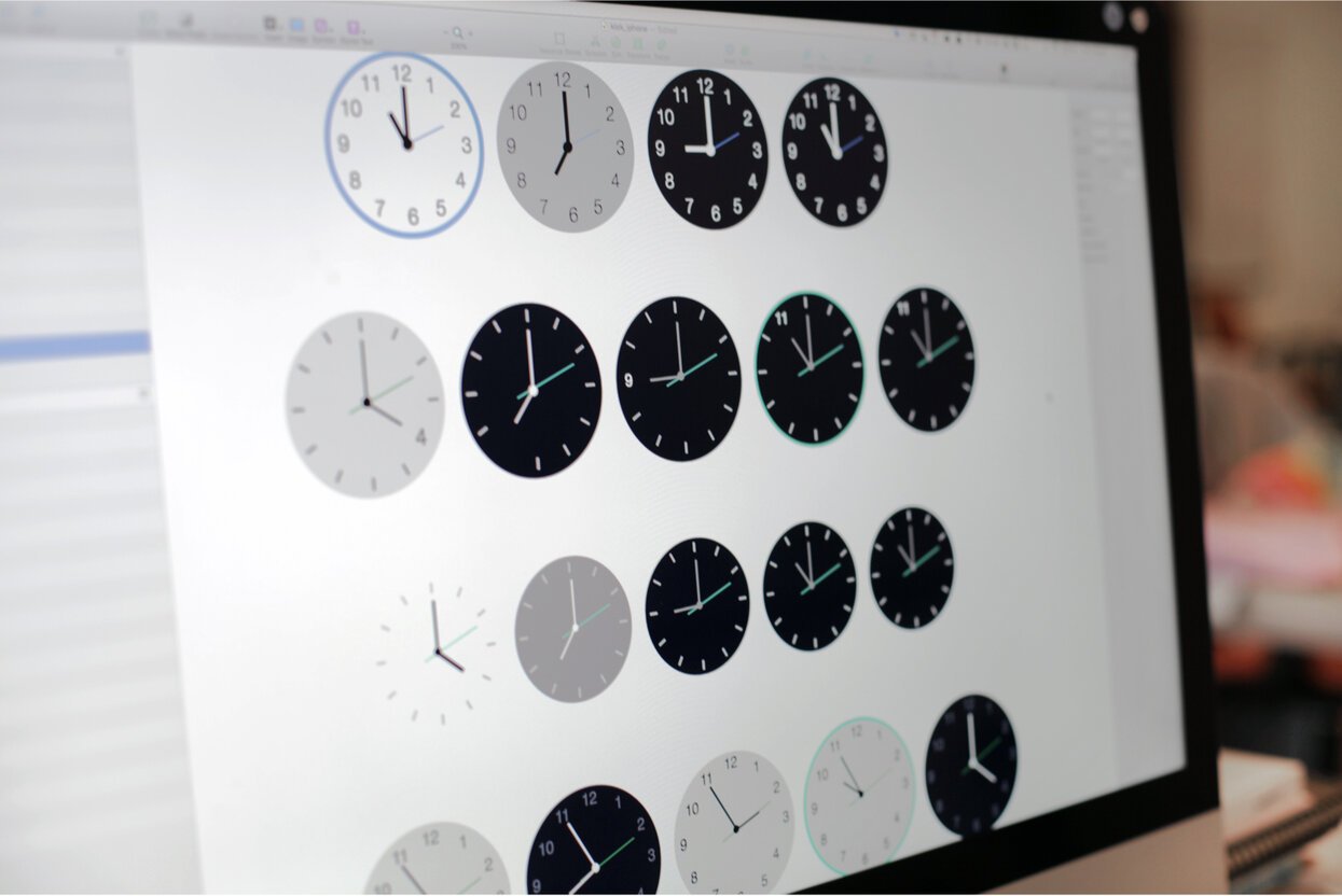
Clock Faces
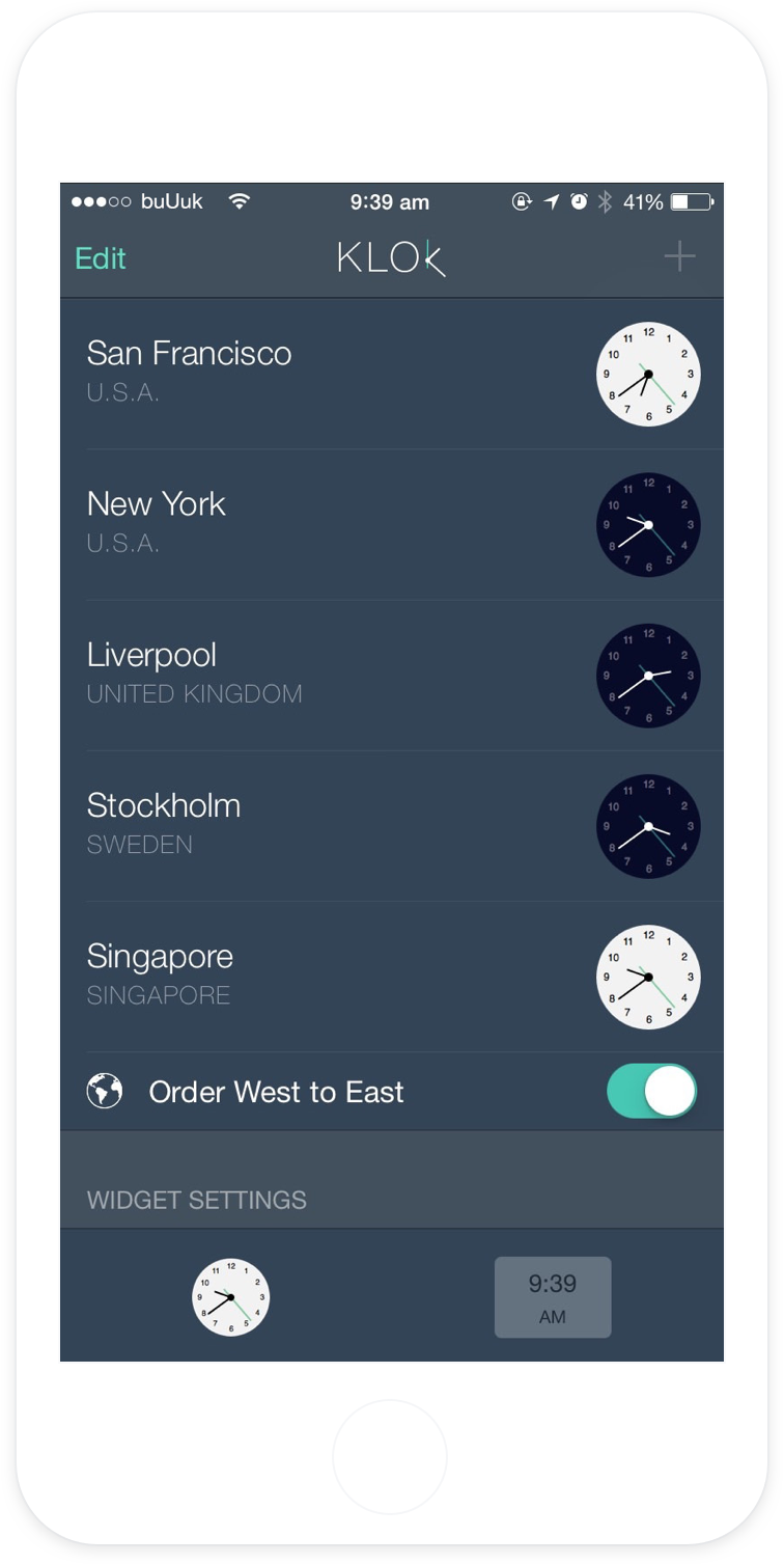
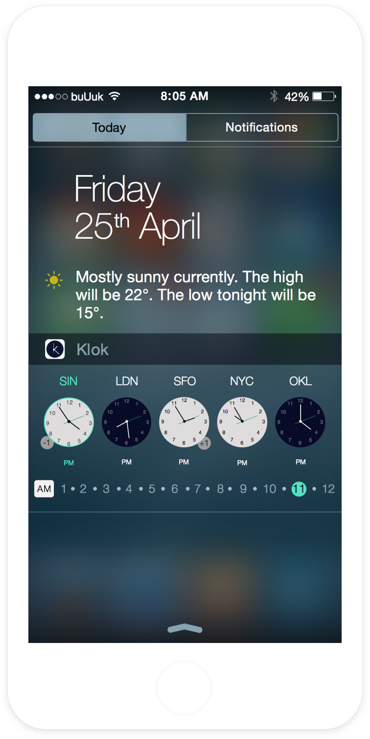
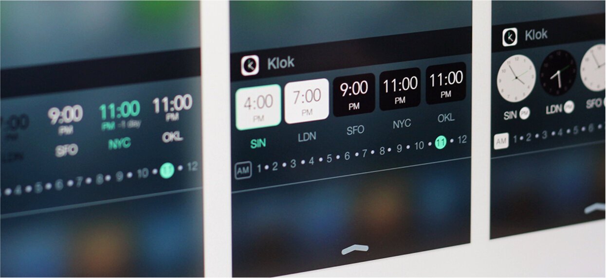
Clock faces can be hard to read at a small scale, so we knew getting the look of the clock face would be crucial. Right from the beginning, we knew we wanted to offer a choice between analogue and digital faces.
Between our users, there's currently a 60:40 split between Analogue vs. Digital.
Clock Background
Using black and white clock backgrounds provide an easy way to see whether it was an appropriate time to make a call. Black means no, white means go ahead and make that call. The times are set to be in line with Apple's native phone app i.e. 6am to 6pm.
Day Indicator
The International Date Line posed an interesting design challenge. We tried out a number of solutions to neatly show whether the time zone was a day ahead or a day behind.
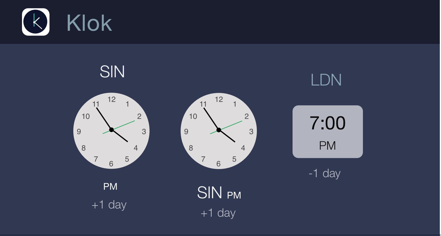
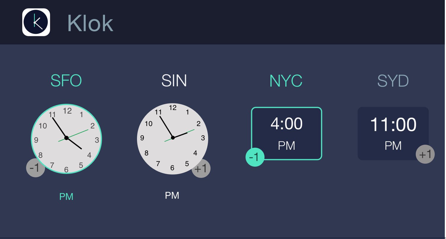
After quite a few ideas & iterations, we decided on a neat +1/-1 bubble enabling users to quickly get the information, but without taking up precious space in the widget.
Time Selection
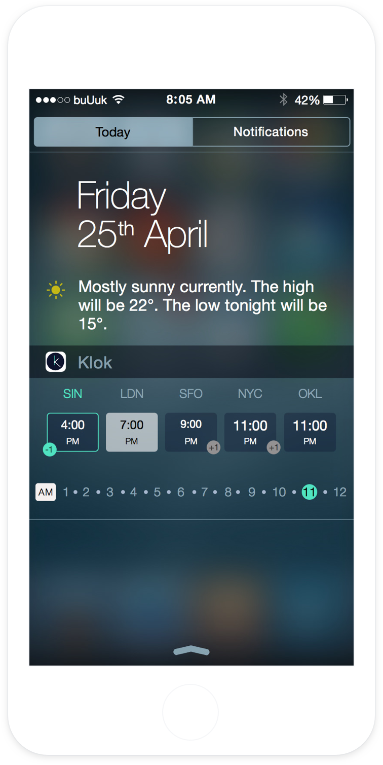
This was one of the biggest design decisions, but one of the subtlest for users. We wanted to find a neat way for users to change the time on the clocks e.g. to understand if it’s 4pm in Singapore, what’s the time in San Francisco?
We tested a number of different time intervals to figure out how we could fit a 24-hour period into the widget space. We tested out the smallest area a finger could accurately hit, before deciding on 30 minute intervals, complimented by an AM/PM button.
User Onboarding
As adding widgets was a relatively new thing for most users, we wanted to provide a quick tutorial so they could easily install Klok and then find it again as they used it.
Our initial design for the introduction was a bit complicated, and we wanted to make it more animated.
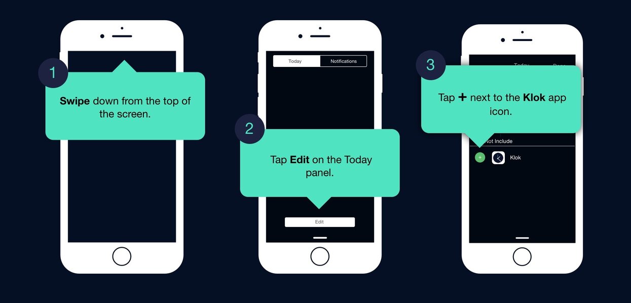
We then tried out another design that shows the user how to use the widget before they enter the app. But we eventually decided to put small ‘hints’ inside the widget itself.
Different Platforms
During the time we were thinking about Klok, Apple announced the launch of the Apple Watch. This got us really excited, as it seemed like Klok would make so much more sense on a watch. So we started working on a Watch version…
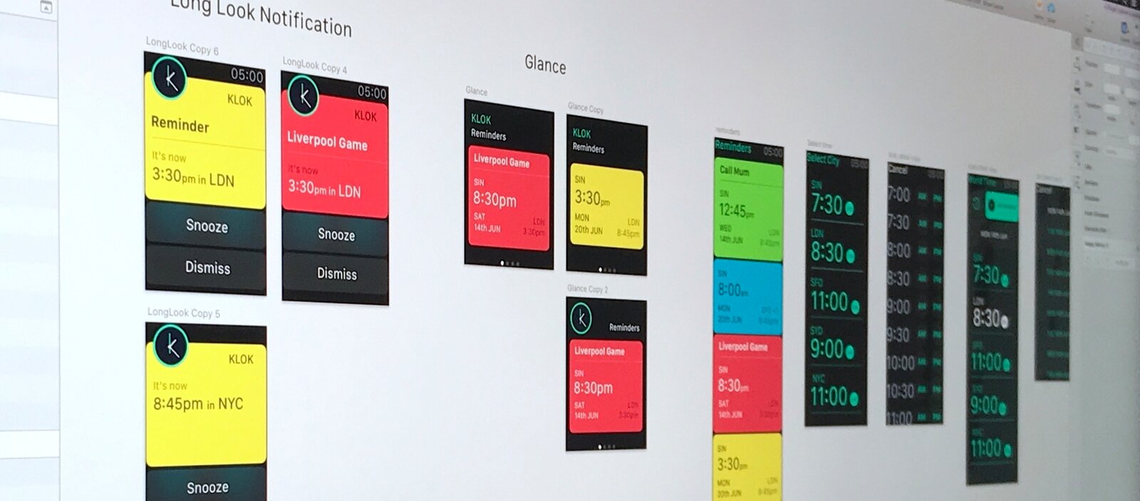
However, Apple rejected the initial concepts, they felt those were too close to some default functionality that they were building. We started working on a changing the core concept, but after a few weeks decided to shelve it for now. We do plan on revisiting this.
Final Designs
A clear and simple design meant every little detail was crucial. We went through several different iterations and stages of testing before we landed on the best solution.
The Launch
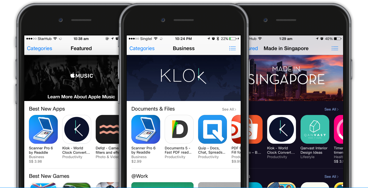
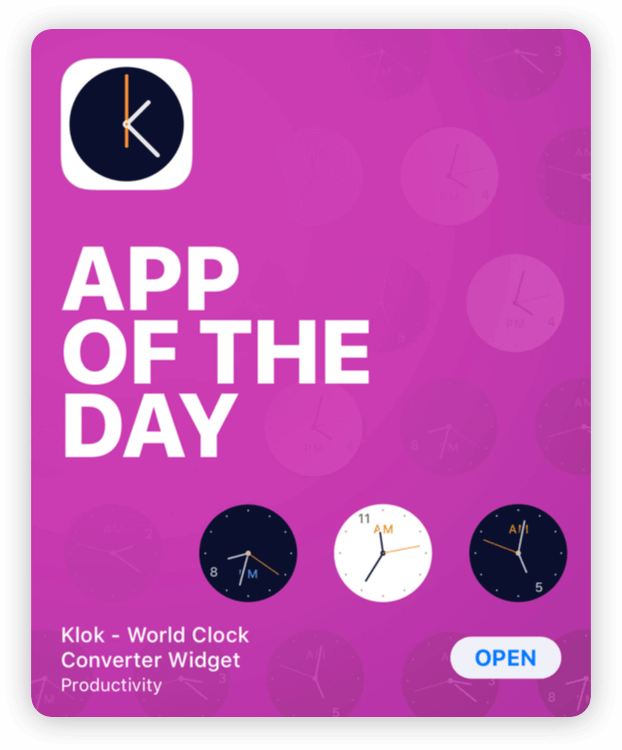
Apple featured Klok in various categories across the App Store and in 140 countries. We also got featured on Product Hunt (woop!), which led to articles and features on a number of blogs and industry sites.
Since Apple hasn’t turned its world clock into a widget yet, Klok just removed another reason to pay attention to the default iOS clock app, which I long consigned to a folder full of redundant Apple apps.
Klok is… a handy time zone converter widget that gets the job done. Unlike other time zone apps, options and visual modifications are kept to a minimum, resulting in a good set-up-once-and-go experience that … offers a convenient time travel feature by simply tapping the widget.
If you work across timezones or need to keep track of them, this widget is what you have been waiting for.
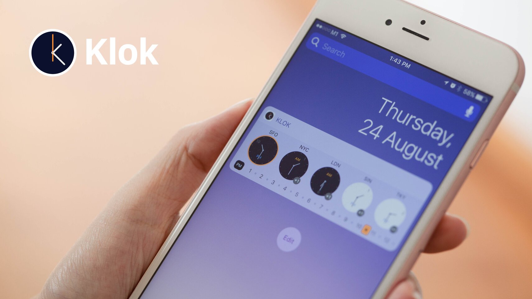
Klok provides a widget for your Notification Center. So, no more scrambling while in a hurry to unlock your phone, open a world clock app, and get what you need.
