The most comprehensive weather portal for Singapore Govt.
Here's how we went about creating an app that was shortlisted by Singapore's Prime Minister, Mr Lee Hsien Loong, for his National Day Rally speech


Client
National Environment Agency
Deliverables
Design & Development for Mobile, Tablet & Watch Apps (iOS & Android)
Period
2016 – Ongoing
NEA launched the first version of the myENV app in 2011. It has since been downloaded over 500,000 times. Users are familiar with the original interface — they know how it works and where to find the relevant information. So how do you follow up with a product that doesn't confuse existing users while introducing a new interface in the hope of creating a better experience? Not so easy.
We interviewed existing users, studied the numbers and had in-depth discussions with the stakeholders.
We started by gathering as much information about the usage patterns of existing users as we could. We interviewed existing users, studied the numbers and had in-depth discussions with the stakeholders. This was followed by ongoing sessions throughout the project to explore new directions, receive feedback on mockups and wireframes, and conduct tons of testing. That’s a lot to do when you’ve got to deliver on 2 platforms with only 6 months to launch.
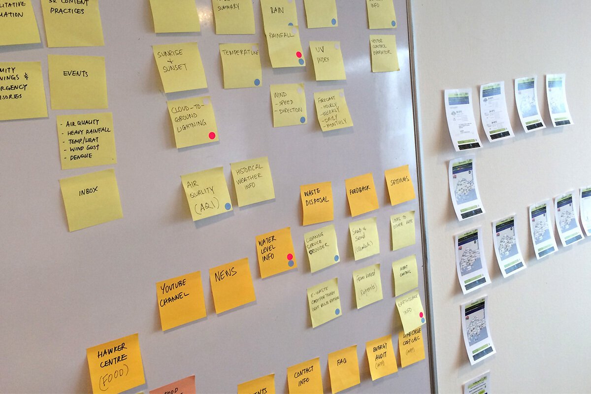
Data = Information
A look at the stats from the last year, collected from the original myENV app, clearly shows which information users are looking for.

Experience Counts
The experience and knowledge gained from our other projects helped us a lot during the last 6 months. Location-based weather alerts from WeatherLah were integrated into the myENV app. Although the project started earlier this year, we had been considering how an app like this could function for some time.
This is a video we made during one of our early prototyping exercises last year — before we were awarded the project.
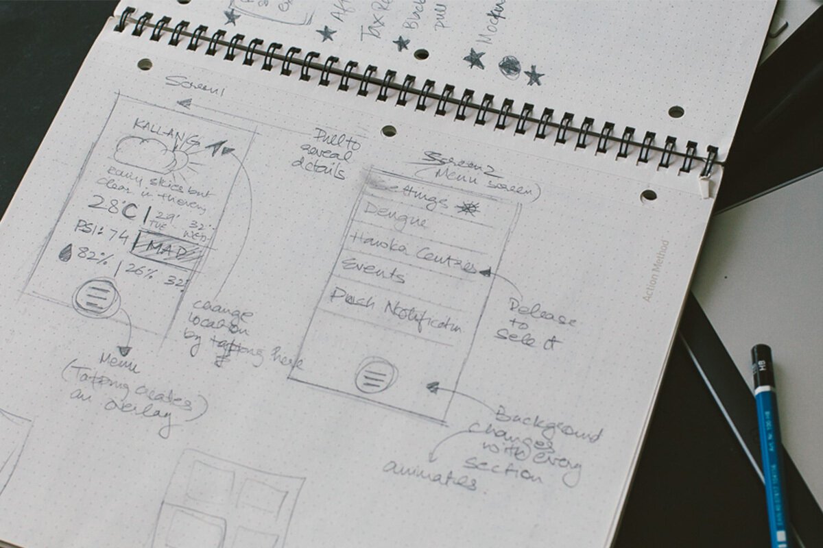
Take it Apart. Begin.
Having established the constraints, we started brainstorming the information architecture for the new app. We went through more than a dozen iterations of the wireframes, all of which were reviewed by 13 different NEA departments at every step.
Once the basic architecture stopped evolving between iterations, we replicated it for the different platforms & devices.
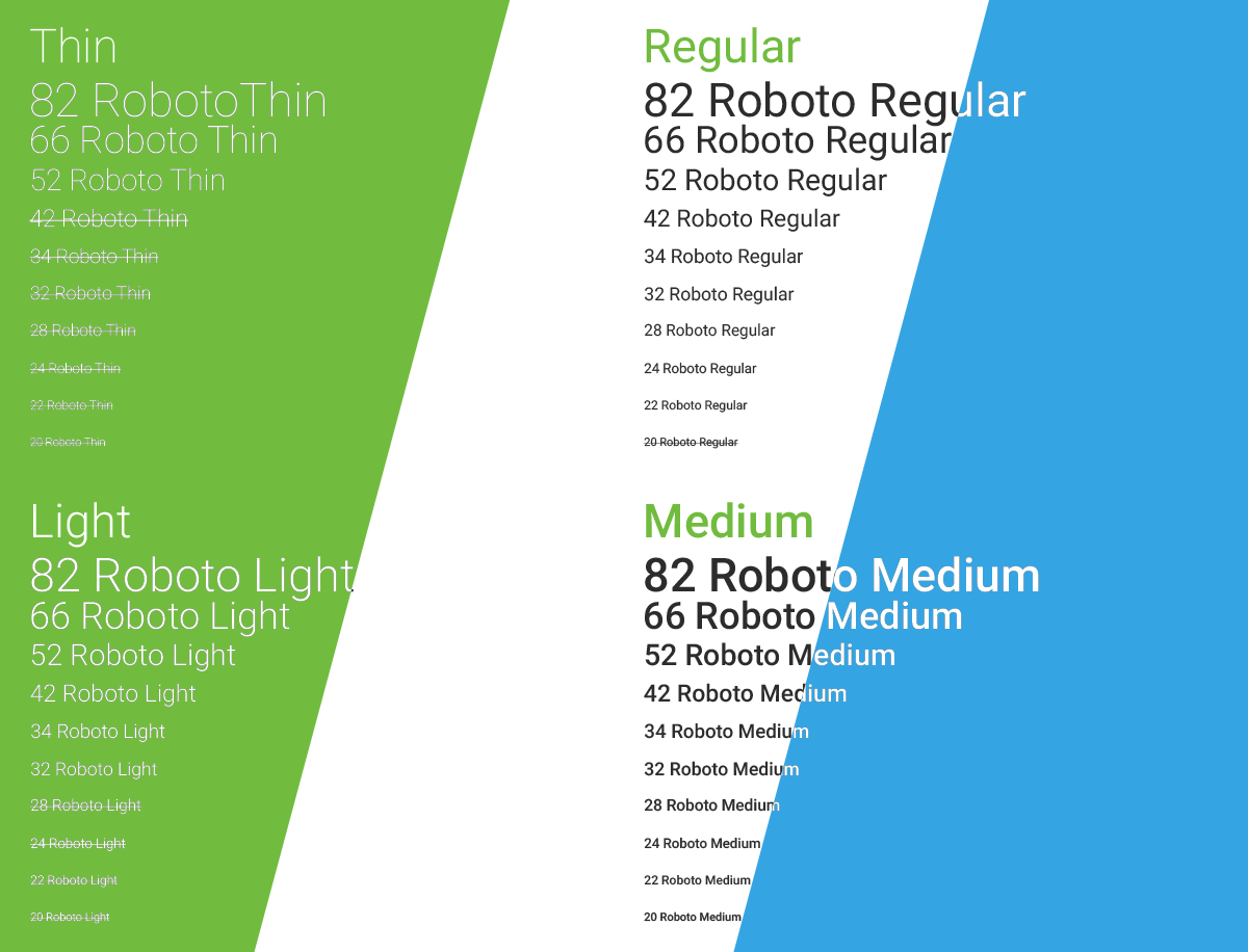
Before heading to Photoshop* to create the pixels, we set up a "project language". There were multiple designers and developers working on this project, so we needed a base style guide that everyone was aware of. An expanded colour palette and a typographic scale were the first steps to achieve this. When the the designs were eventually delivered to the developers, they were accompanied by detailed specs for each unique aspect of the app.
*Although we've been using Sketch for most products at buUuk, we opted for Photoshop in this case.
Colour Guide
Based on NEA's own colour guide, but expanded to include more colours

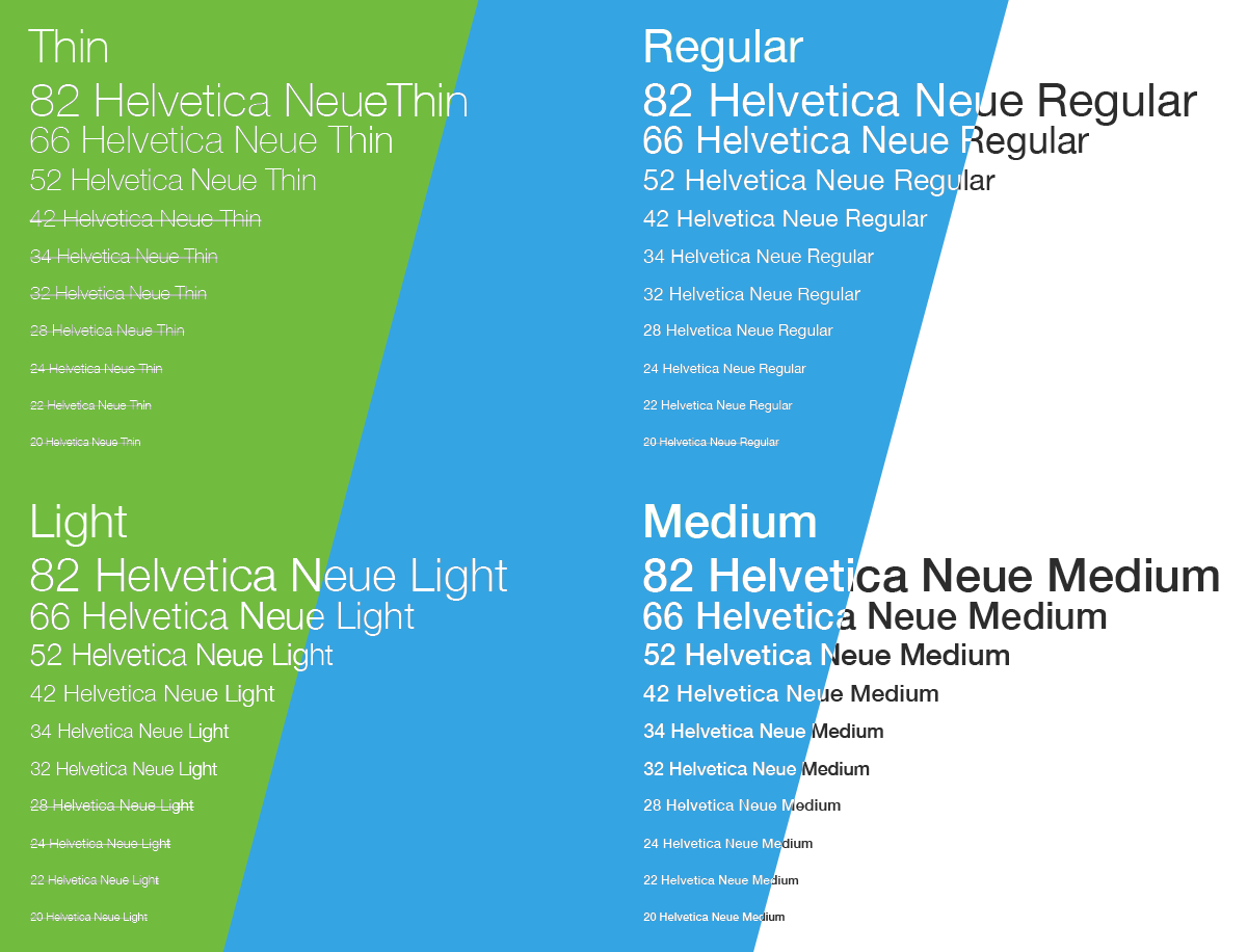
Type Scale
As the app users include people of all ages, we knew borderline small font sizes were out. Also, we tried to ensure that there was always a high enough contrast between the type colours and the backgrounds they were used on. Native fonts for each platform were used for maximum performance.
Icons
How many different ways are there to draw a cloud? The myENV app has enough weather conditions to make it quite a challenge to come up with unique icons for each of them. We set out to create a set which didn't crowd the icons with too much information (of course, we had plenty of good references out there). We decided to club "similar" weather conditions together, providing only subtle variations in the icons. This is evident in the icons for rain, showers, thunder & thunderstorms.
Detailed UI Specs
In retrospect, spending time to create these proved invaluable for a project of this level of complexity. Whenever the mockups weren't accompanied by specs, we often faced additional rounds of review and the frustration of redoing work. The wireframes, mockups & design specs became the point of reference for everyone working on the project.
Simplicity & Detail
It was clear from the early stages that balancing the requirement to create a comprehensive app with the need for a simple interface would be our biggest challenge. We looked for solutions that would present the most relevant information in the most prominent manner while hiding the secondary information in a neatly organised way.
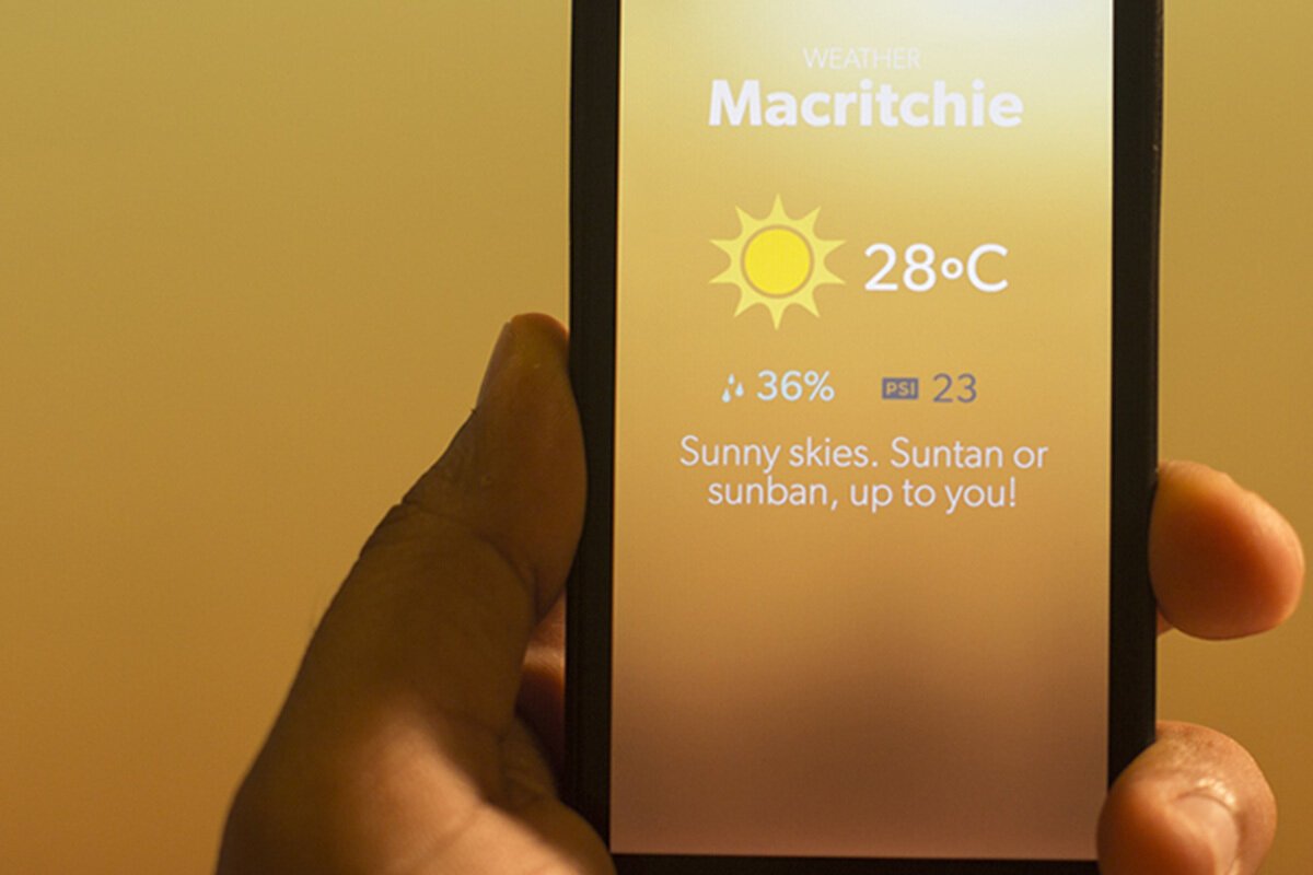
Summary Cards
This section summarises information related to your current location. Tapping on any of the cards reveals detailed info about the entire island.
Contextual Info
For when you need to determine which icon is for "heavy showers" & which one is for "passing showers", just tap the icon.
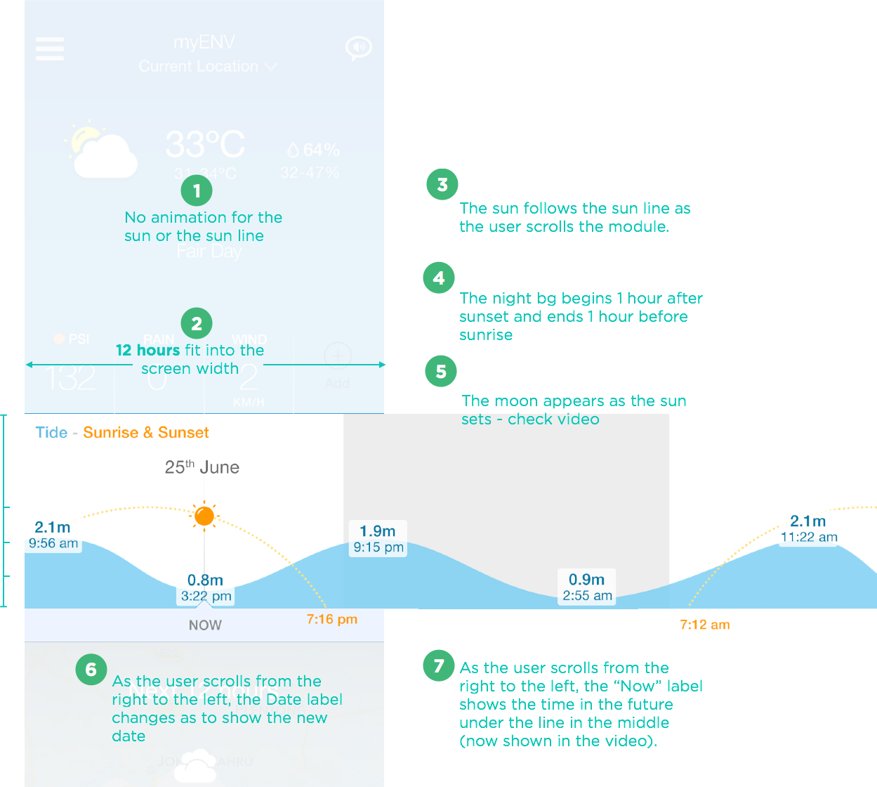
Tide, Sunrise & Sunset Times
Interestingly, tide timing information was one of the most requested features by existing users of the original app.
How did we do?
Delivering a new product on so many different platforms isn't easy. Especially with such an ambitious timeline ahead of you. We learnt that you have to move fast between iterations. The more ideas you explore during the initial wireframing stage, the less changes you encounter later on during development. Use your design phase sensibly — educate your client as you move through the project and use low fidelity wireframes to quickly create different user scenarios.
Of course, none of this is possible without a team that trusts and supports each other.
NEA myENV
Download the latest myENV apps on the Apple App Store and the Google Play Stores