blog
Everything You Need to Know About Designing a Mobile App
Design App development April 9, 2021

Smartphones are becoming an essential part of our lives, now more than ever before. We spend as much as 5 hours a day on mobile: especially on iOS & Android apps and websites. With this increased usage of phones, the customer demands are touching the sky, particularly in terms of UX. The only difference between a good app and a bad app, lies in the quality of its user experience (UX).
In order to be successful, UX must be considered as the most essential component of product strategy along with fast loading time, ease of use, and delight during the interaction. Here are some of the most important things that you should consider when designing apps for mobiles.
Minimize Cognitive Load
It refers to the amount of brainpower you need to use an app. Since the human brain can only process up to a limit, providing too much information at once through an app might overwhelm the user making them abandon the task. Here’s what you can do:
1. DECLUTTERING
Clutter is the worst enemy of good design as it overloads the users with too much information making it more complicated. Get rid of anything that isn’t necessary as it will improve comprehension. Make sure to:
- Keep the content to a minimum i.e., offer only what the user needs.
- Keep interface elements to a minimum i.e., a simple design with ease of operation.
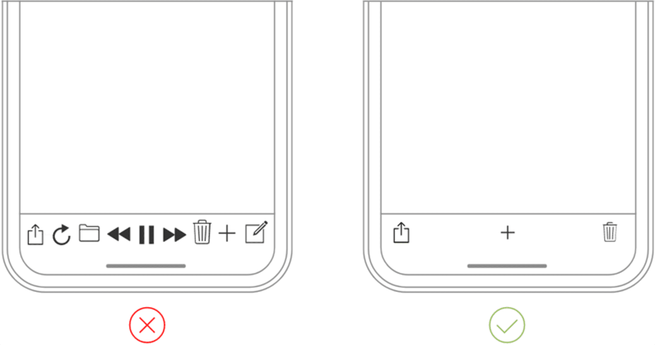
- Implement the progressive disclosure technique to show more options.
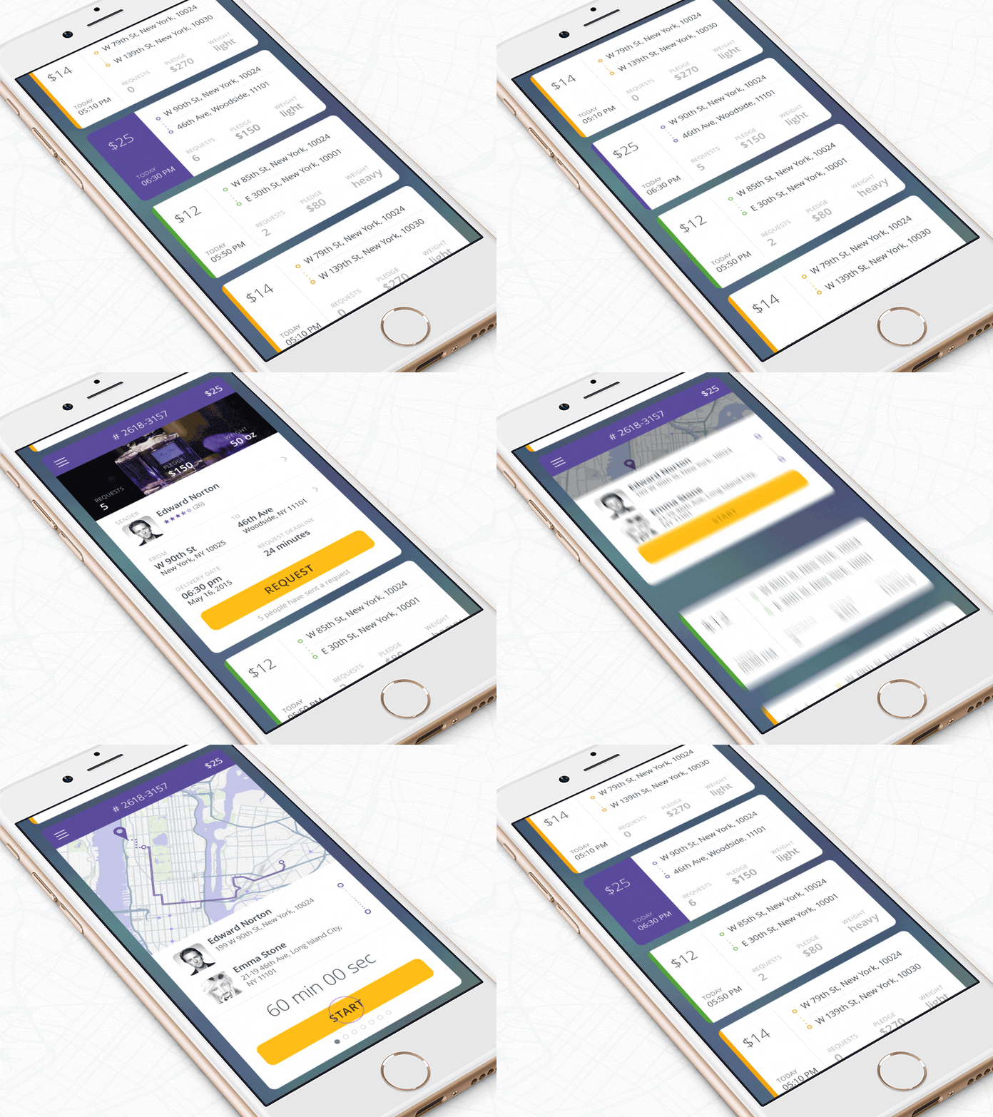
2. OFFLOAD TASKS
Simplify anything that requires user effort such as entering data, making a decision, etc., and also look for alternatives. For instance, previously entered data can be reused in some cases instead of asking the user to type more.
3. BREAK TASKS INTO BITE-SIZED CHUNKS
Tasks and actions that require a lot of steps can be divided into a number of subtasks to decrease complexity for the user. A perfect example of this case is that of a step-by-step checkout flow in an e-commerce app.
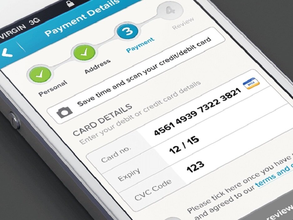
You can also connect two different activities via chunking such as browsing and purchasing. The users can more easily process the steps that have a logical flow.
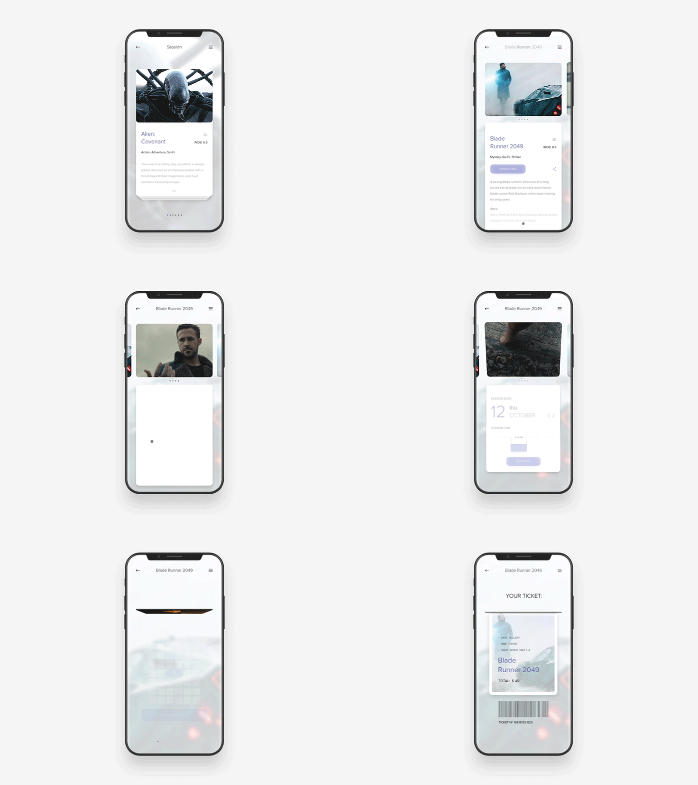
4. USE FAMILIAR SCREENS
Users are familiar with screens like “Getting started,” “What’s new” and “Search results” and they don’t require an additional explanation about the same. It’s a smart way to enhance UX with no learning curve.
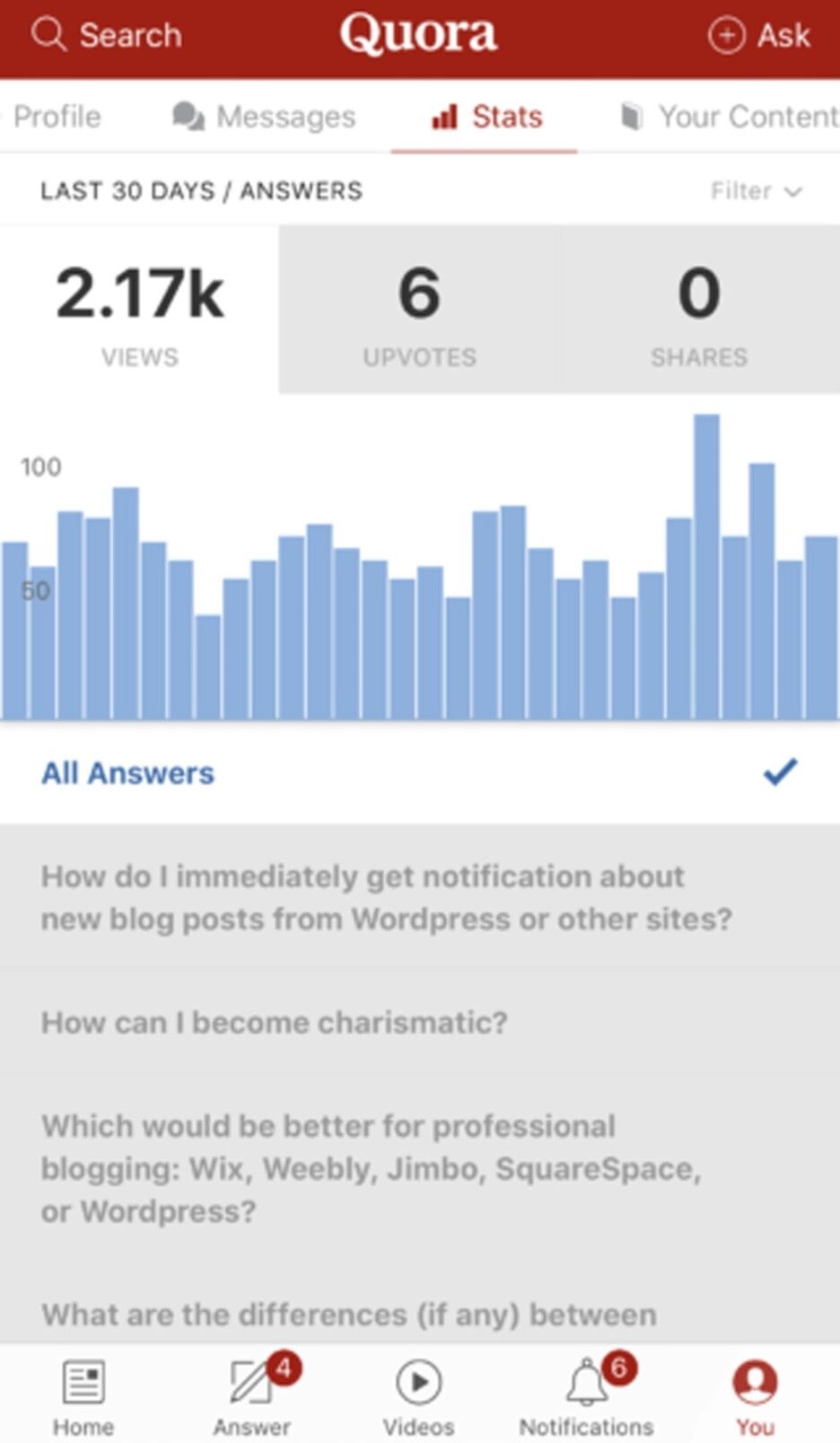
5. Minimize User Input
- Keep forms as short as possible; ask only for minimum information from the user.
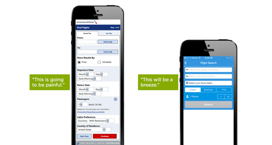
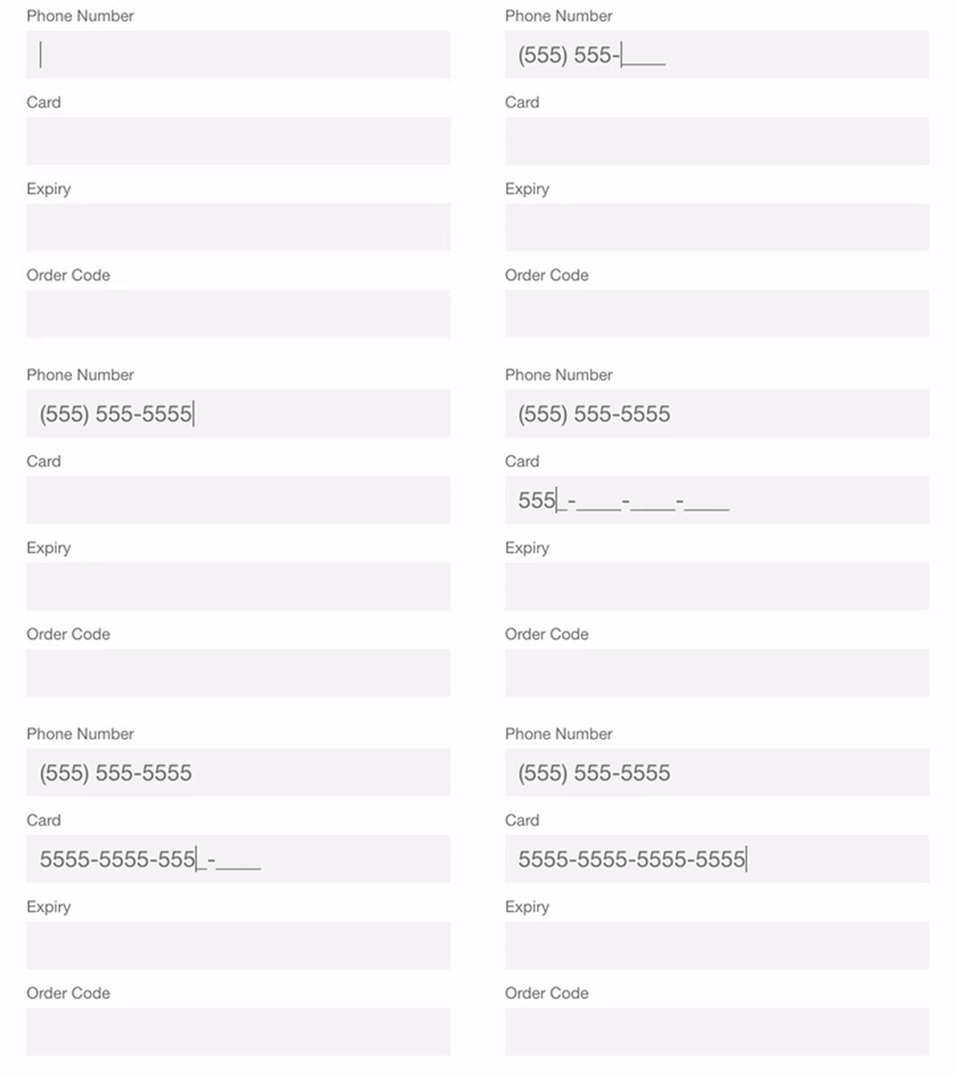
- Offer field masking so that users can format inputted text. Use smart features like autocomplete.
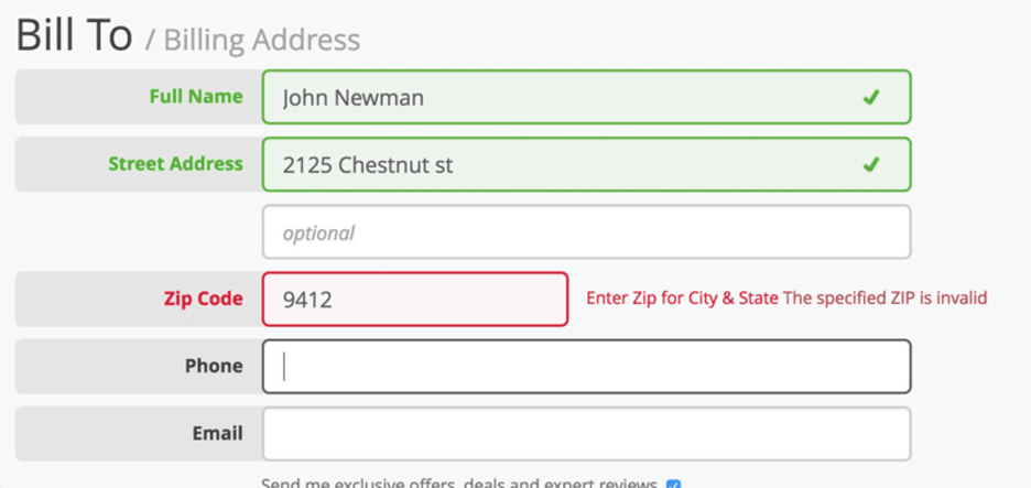
- Dynamically validate field values i.e., check field values immediately after entry and notify in case of errors.
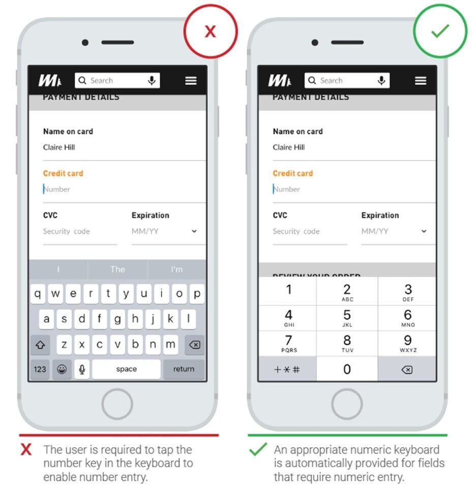
- Customize the keyboard for the type of query i.e., numeric, alphabetic.
ANTICIPATE USERS NEEDS
1. Information and References
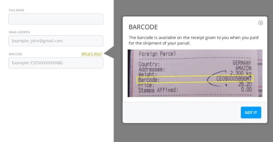
- Offer help wherever users might need it; add images of text for reference.
2. USE VISUAL WEIGHT TO CONVEY IMPORTANCE
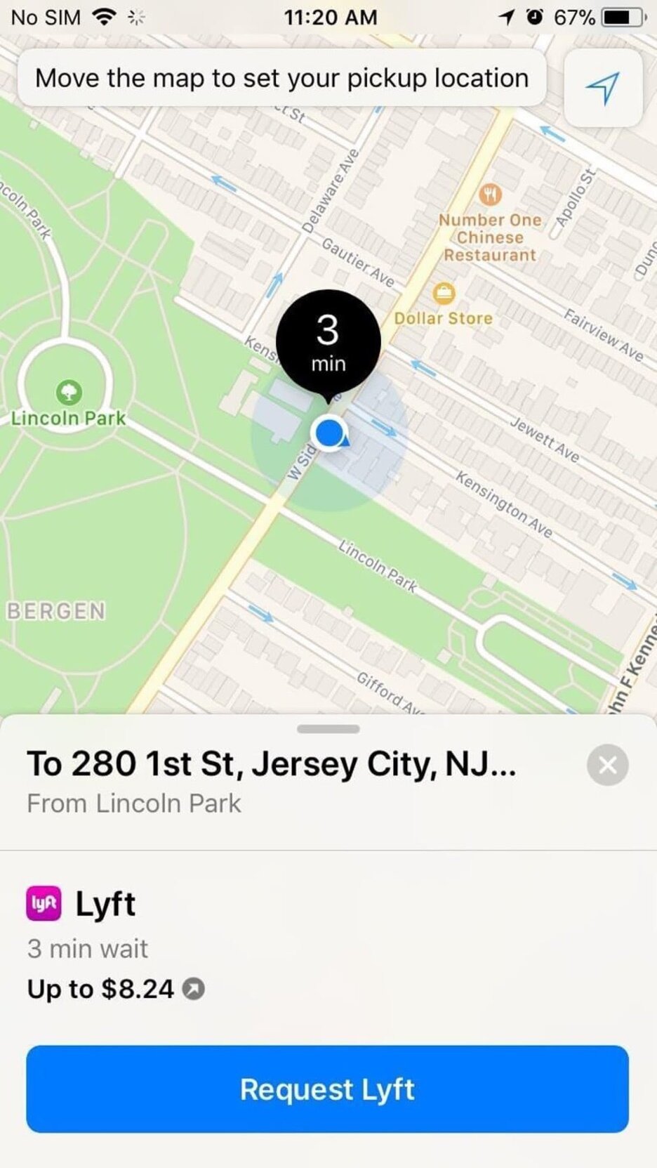
Visual weight, the most important element, adds more weight to an element by highlighting the font, increasing the size, and enhancing the visibility of the colour.
3. AVOID JARGON
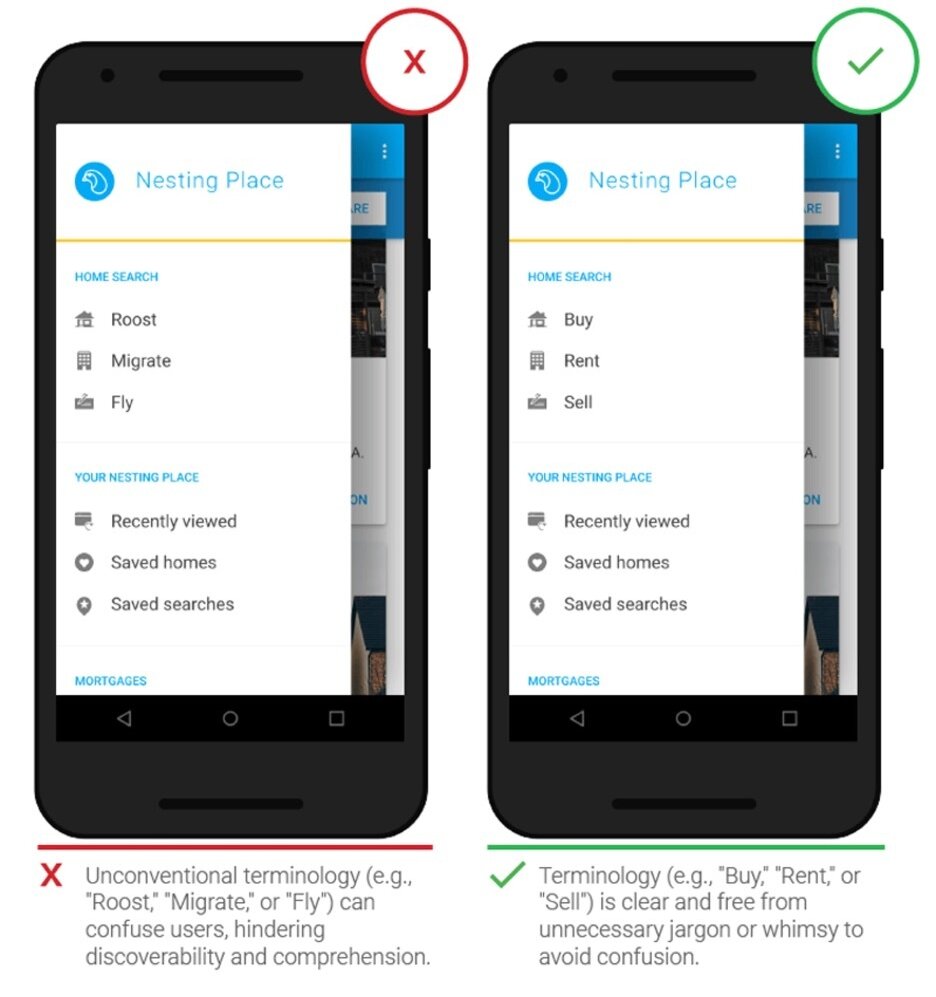
Always use clear communication in any mobile app. Use all that you know about your target audience to determine whether certain words or phrases are appropriate.
4. MAKE THE DESIGN CONSISTENT
Maintain the visual consistency: typefaces, buttons and labels, functional consistency: interactive elements, and external consistency across multiple products.
Design An Accessible Interface
1. BE AWARE OF COLOR-BLINDNESS
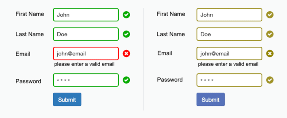
Use contrasting colours to indicate errors. These will act as visual signifiers that will ensure that users will be able to interact with an interface.
2. USE STANDARD NAVIGATION COMPONENTS
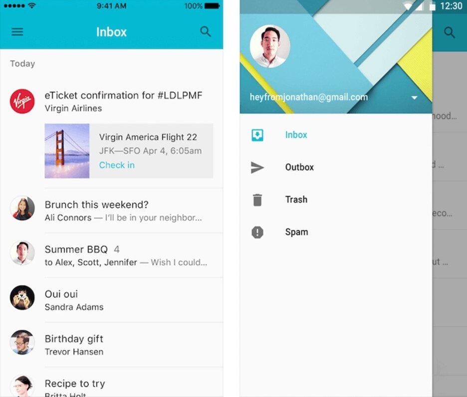
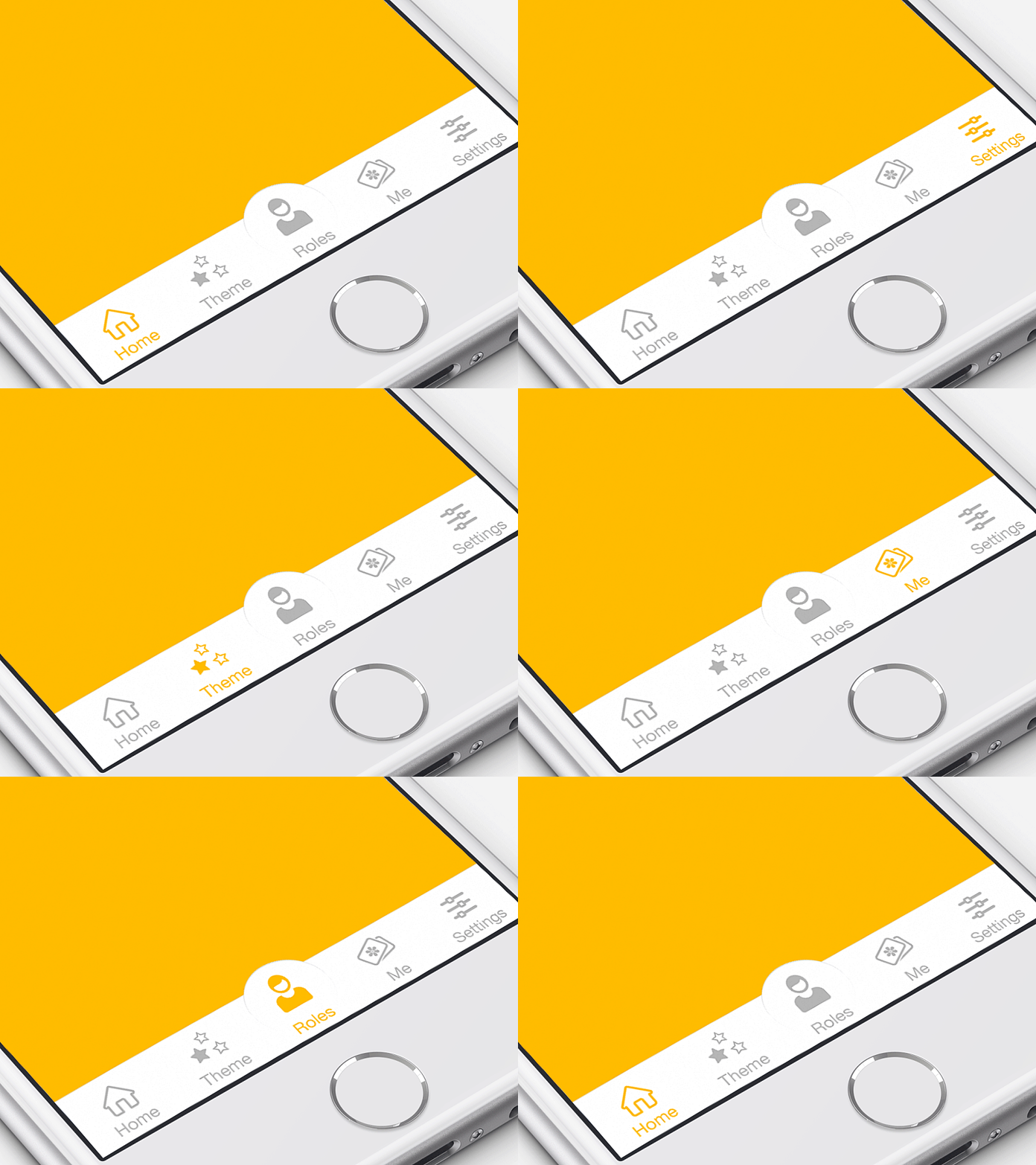
Standard navigation patterns such as the tab bar (for iOS) and the navigation drawer (for Android) are always beneficial since the majority of users are familiar with both these navigation patterns.
3. COMMUNICATE CURRENT LOCATION
The most fundamental question users ask: Where am I? Hence, they must know where they are via your app at any moment.
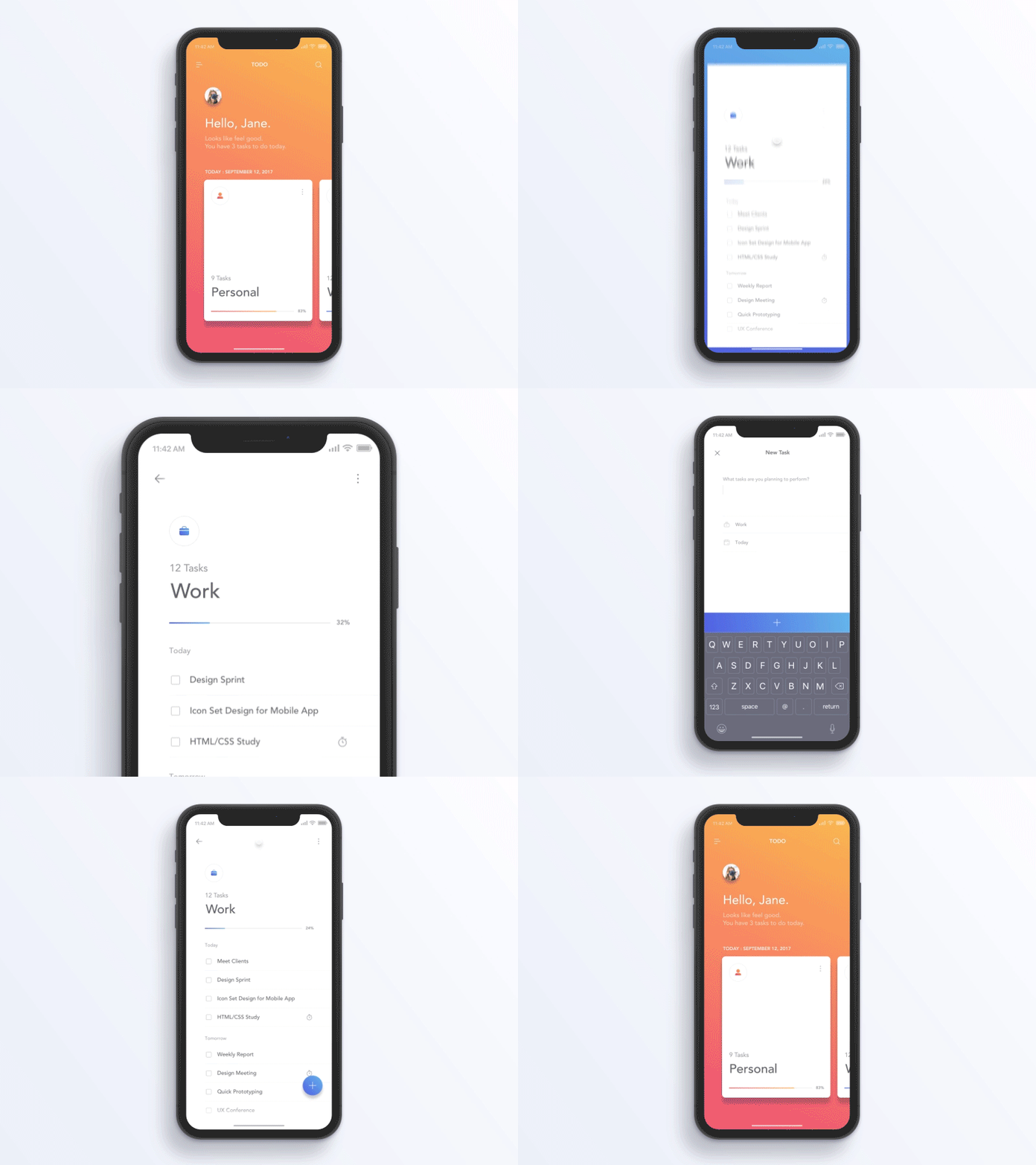
4.USE FUNCTIONAL ANIMATION TO CLARIFY NAVIGATIONAL TRANSITIONS
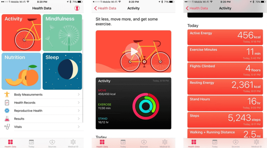
Animation is an ideal choice to describe state transitions since it helps users comprehend a state change in the page’s layout along with what caused the change and how to initiate the change again when needed.
Focus On The First-Time Experience
1. AVOID SIGN-IN WALLS
A sign-in wall, mandatory registration before using an app, is the most common reason why users abandon apps. The number is higher for apps with low brand recognition or those with an unclear value proposition.

2. DESIGN A GOOD ONBOARDING EXPERIENCE
Delivering an excellent onboarding experience is the key to retaining users as it shows the value your app provides.
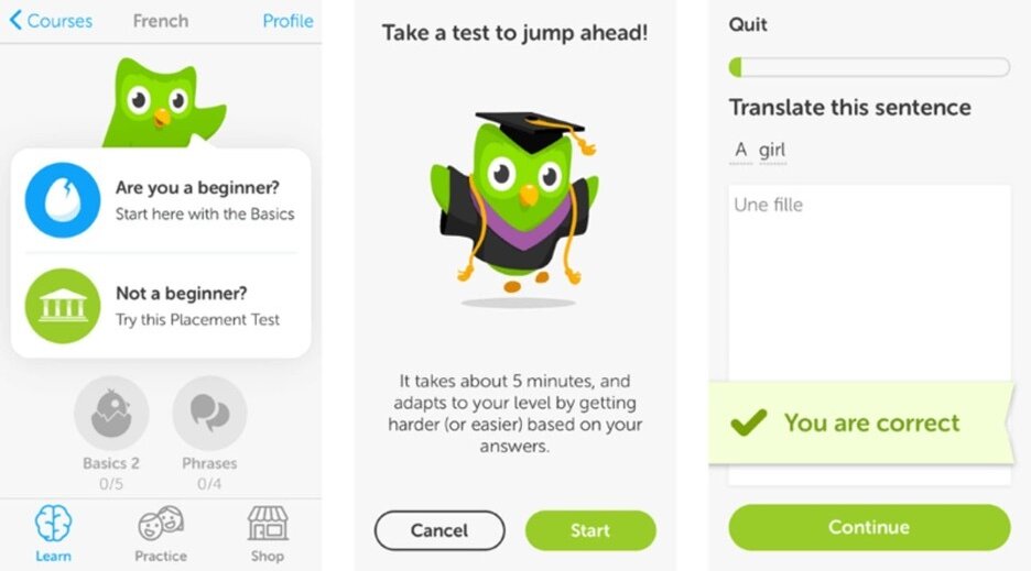
Another useful thing while onboarding: an empty state, a screen whose default state is empty and users need to go through one or more steps to populate it with data.
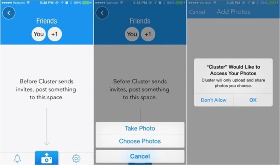
3. AVOID ASKING FOR PERMISSIONS RIGHT AT THE START
Only request permission at launch when it’s necessary for your app’s core function or else the users will drift away.
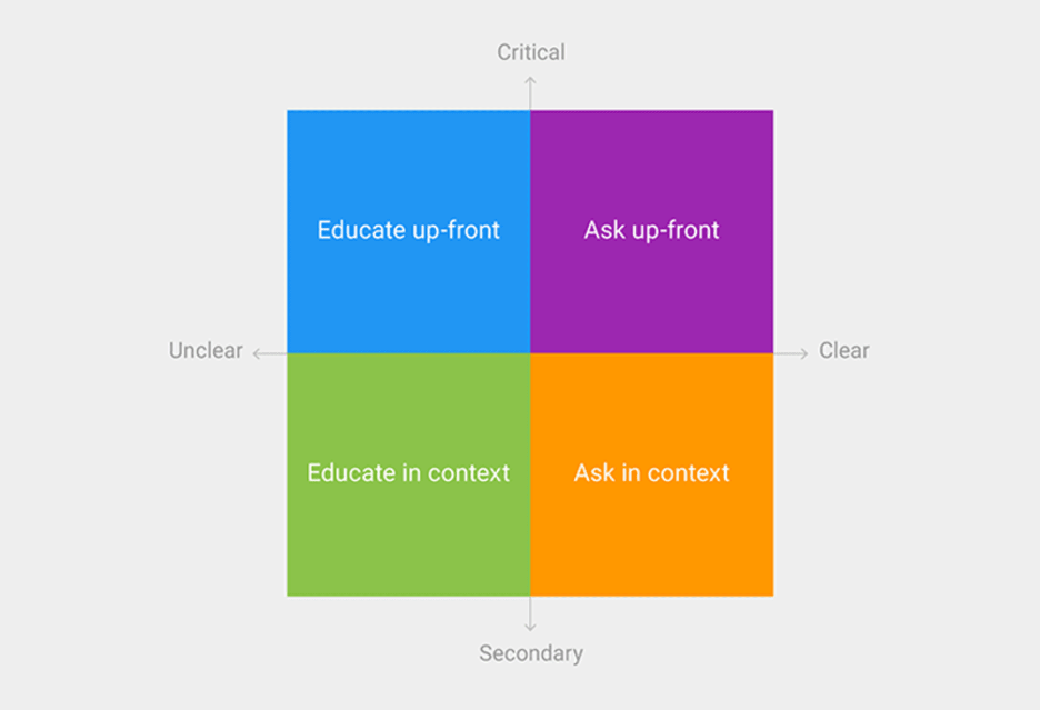
Ask for permissions in the context in all other cases since the users are more likely to grant permission asked during a relevant task.
Endnote
Ideally, a great design should be a perfect combination of beauty and functionality: something that you should be aiming for while building an app. But don’t get devastated if you fail to build a perfect app right on the first attempt. It is almost impossible. Instead, focus more on treating your app as a continually evolving project that will get better with time. You must use data from testing sessions and user feedback to enhance your app and create better versions of it.

