blog
How we made Klok
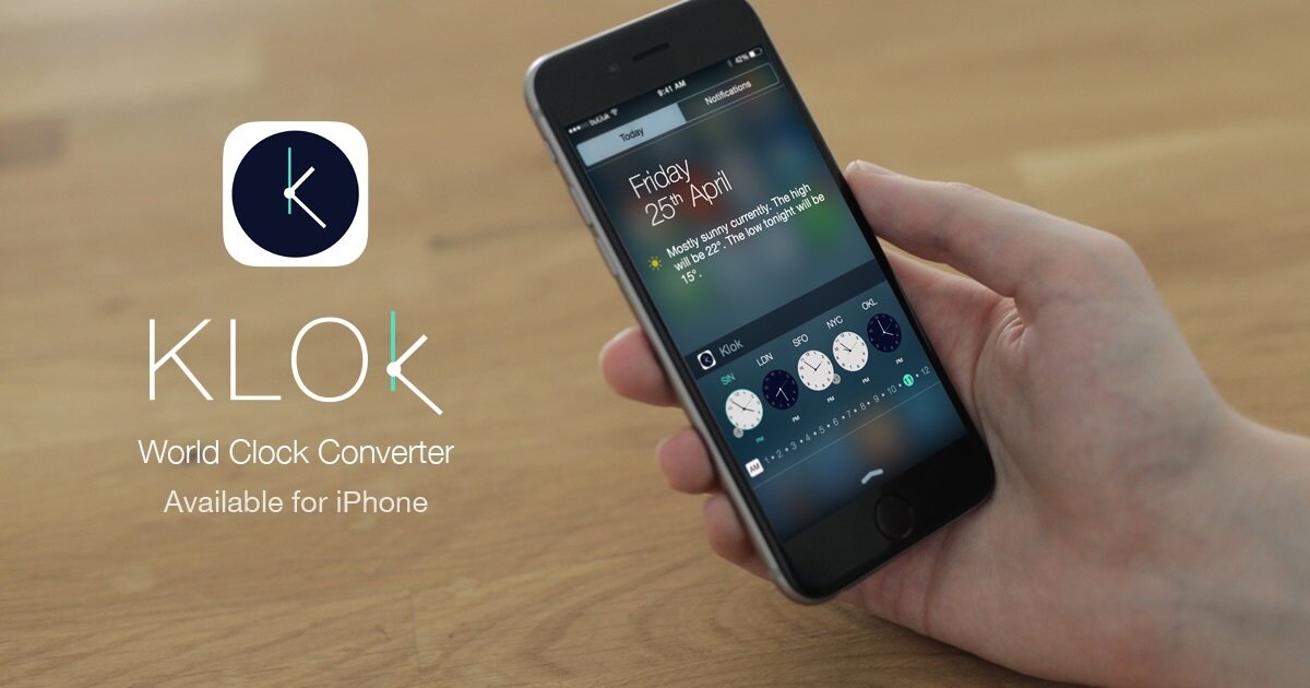
Today, we want to say a big hello to our latest app – meet Klok, a time zone converter widget, making our global lives easier.
Now that you know how Klok works, we wanted to share a bit of the story about how it came to be. We spoke to the Lead Designer on Klok, our very own Mark Law.

What was the inspiration behind Klok?
It was initially Nav’s idea [Navjot Pawera, BuUuk’s Head of Design], who was thinking of ways to make the expat life a little easier.
“My brother lives in San Francisco, my parents are in India, I have friends in Norway (I used to live there), my wife’s family lives near London, and I live in Singapore. It’s always really hard to schedule a time to chat that works for everyone.”
— Nav
We see it at work too; we’re working with partners in India at the moment, so finding a time for calls can be challenging.
Around the same time, iOS 8 had just introduced the ‘widgets’ feature – where you can pull down information in your Today view – and we started thinking we could design a clock-style widget which could sit there. It was a small design decision but it really changed our approach.
How did you approach the design?
Initially, we needed to understand the limitations of the widget. It’s not as interactive as a conventional app. There are only two tabs ‘Today’ and ‘Notifications’, so we knew we could only use a tap motion, rather than swiping.
The width of the phone was also a constraint – one of the biggest challenges was figuring out how to fit 24 hours into a small space. We spent time doing different visualisations, such as looking at analogue v.s. digital, how to change the time, time intervals. In the end we broke it down into 30 minute intervals and used an AM/PM button.
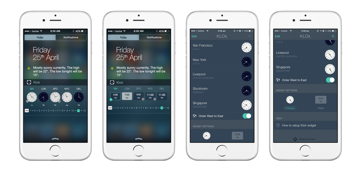
The final touch was to use the colour of the watch face to easily determine if it’s an acceptable time for a call – black means it isn’t, white means it’s ok. That way, you can find out at a glance if the person you want to speak to will be awake…critical!
How did you take the design and transform it into a working prototype?
First of all, we made an initial prototype in Pixate. This is a really good way of testing out the proof of concept and usability. It’s also really helpful when showing the developer your idea so they can understand how it works.
Hon Cheng then came on board and built a working prototype for us. The BuUuk team all then went away and tried the prototype out over a few days. This enabled us to improve the user experience and iron out any bugs.

We went through a few iterations to ensure we kept things simple. One of the main difficulties was deciding what things to leave out. A few of our beta testers wanted to have a reminder function in the app. We left it out in the initial version but we are looking at including it in v2.
We also presented it at a Product Hunt meetup in Singapore, which was a great way of getting a lot of really constructive feedback very quickly.
What challenges did you face?
Surprisingly, the biggest challenge was at the core of the app itself – time zones. They are hugely complicated! Things like daylight savings changes and countries changing their time zones – there are a lot of anomalies and lots of weird little quirks.
The International Date Line was a big challenge. We needed to have a way of representing what day the different time zones were in. We came up with the +1/-1 badge as a way to show if the time zone is the day before or the day after the one you are currently in.
What’s next for Klok?
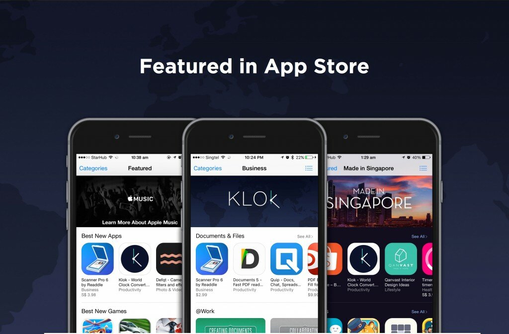
Klok was silently launched on Friday 3rd July. It has been featured globally by Apple under various categories – Best New Apps, Utilities and Business. Klok has also already been downloaded over 38,000 times, so we are really thrilled by the response so far.
We are already looking at launching an Android version of the app – stay tuned!

