blog
Something New: Our Logo!
By Dinh Viet Anh Nguyen Design February 28, 2018
Hi there!
Noticed something new? That’s right – we have completely revamped our website and logo. As Buuuk evolves from being a mobile app development agency to a design-focused platform leader helping clients with their digital transformation, we felt that this was the right time to revamp the look and feel of our online presence to reflect this evolution.
So how did the change come about?
Nav, our Director and Head of Design, explored the initial ideas for a new logo.
The vision for the new logo was simple:
- Clear & easy to read
- Memorable
- Usable in various formats
- A touch of fun
To begin, we literally doodled over a 100 different versions …
The name “buUuk” can be confusing (with its 3 “U”s), so it’s especially important that the new logo creates a strong impression on you – our website visitors and clients. This is why it was decided that the new logo will be a script-based one.
Becoming “Buuuk”
The first version of the logo was drawn by Andrew, our Backend Developer, who is also an illustrator. After the first meeting when the script-based typography was decided on, Nav also wanted the new logo to shift the visual hierarchy towards the “B”.
Capitalising the “B” allows the attention to be shifted towards the front of the logo. The asymmetrical composition also creates a more modern feel to the logo, as opposed to the dated symmetrical styling of the previous “buUuk” logo.
Fun vs corporate: can Buuuk be both?
Another issue that came up during the design process is the balance between having a fun, flamboyant and playful logo, versus a more strict and corporate-looking one. As a young, self-proclaimed fun workplace, where people genuinely enjoy the company of each other and work together with trust and respect, we wanted to incorporate that into the logo as well. At the same time, we are a digital consultancy who works with clients like Daimler, Tupperware and National Environment Agency so it is important to facilitate a corporate personality.
The Details
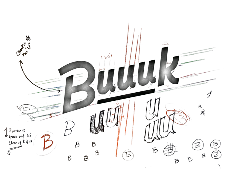
The curved underline under the triple “U”s put a focus on the letters without compromising the visual proportions of the logo, being aligned nicely with the visual flow and emphasising the interesting nature of the company’s name.
The designs of the “B” and the “k” became an important characteristic element of the logo. To avoid a block-type logo which was visually unappealing and too rigid, the lobe from the stem of the “B” was detached. Meanwhile, the smidget of the flourish on the “k” was kept – by keeping the upper leg vertical and the bottom leg slightly curved, this added to the visual proportion of the logo and the touch of playfulness without making it look unprofessional.
Fine-tuning the new Buuuk
For the following sketches, Andrew tried forcing the calligraphy into a more constrained container. By introducing some additional guidelines and construction lines, we were able to exert more control over our letters which helped solve the clarity issue with the “U”s. Having these constraints on the center portion of our logo meant the polar ends had to follow suit.
After more than 100 sketches in total, the new Buuuk logo is finalised. Our designer, Xinyi, then took the final sketch and vectorised it, adding some final tweaks. We created the full name version of the logo and a “B” version for different materials need. And here they are:
See Buuuk’s style guide for all the final versions
Buuuk: a new chapter
We are happy with the result – “it’s bold, clear, and a bit of fun. It’s what we were aiming for.”, said Nav.
In fact, the design principles applied to the logo design process can also be seen in the new website design. When you browse across the new Buuuk’s website, the motif is clear: white backgrounds, bold headlines, standout colours and a clear attention to details like spacing and alignment.
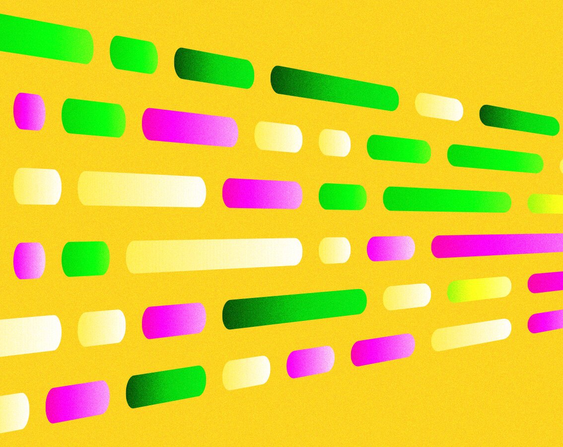
Clarity and readability play an important role in website designs. We use short sentences that speak out in big & bold text – without unnecessary imagery, complemented by colour blocks to emphasise the important points.
“It’s bold, clear, and a bit of fun.”
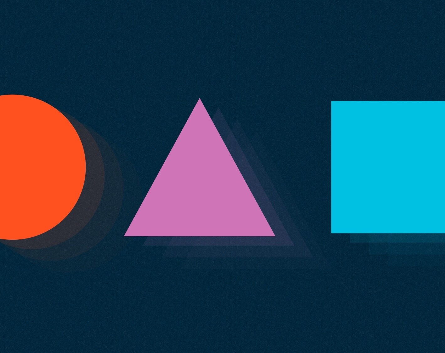
The use of Orange as the primary colour, with Blue and Green for emphasis, allows viewers to be less distracted and focused on particular actions. We also hope to create a stronger association between the main colours and our corporate image, while bringing a visually pleasant experience for the viewers.
Check it out if you haven’t!
You May Also Like